
 Firstly, I will talk about the opening. From my point of view, it was very calm on the beginning, and then BANG - the movie starts. Quite a lot of different shots, angles and effects are involved to create the action. The movie I can think of with the similar beginning can be "The Stepfather". At first, very calm, not really knowing what is going on, and then bang! speed, action, tense, effects. This is really what happened in my title sequence opening.
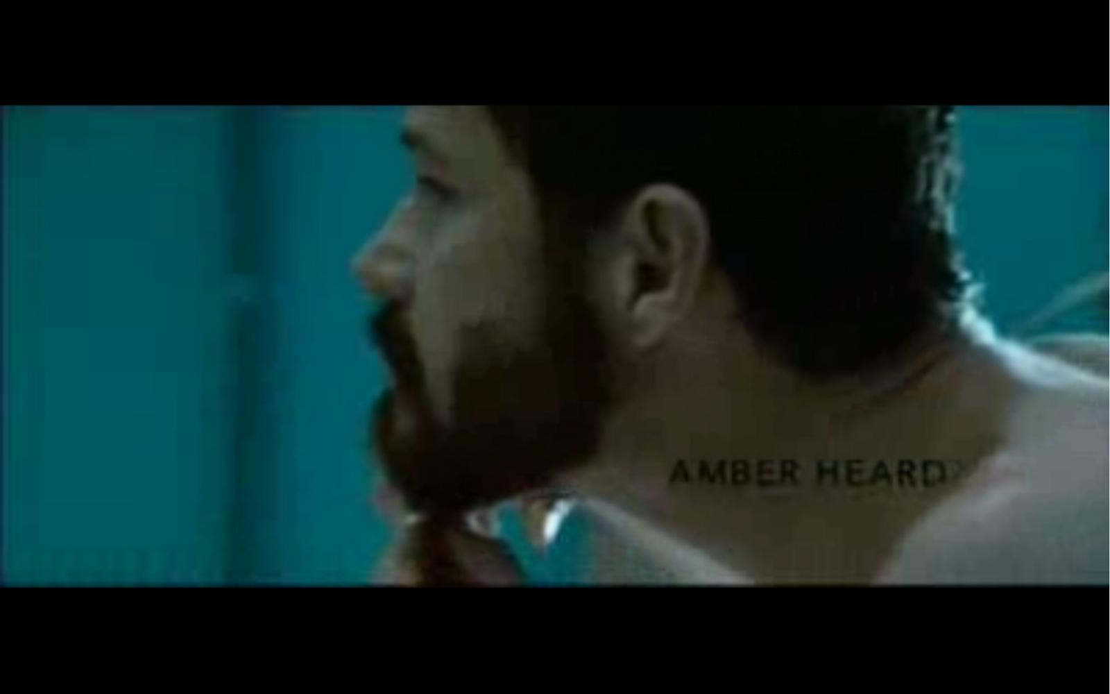

The only difference could be that The stepfather has much longer introduction and time for titles to appear. However, the speed, action and the tempo is quite similar, and I must say that I didn't really think about it before. But I am glad that I happened this way, because the effect is stunning (at least on Stepfather :))


_______________________________________________________________________________
My titles are pretty effective, stylish, bald and eye-catching, however I did not mention a lot of names and the order of appearing really is different to other movies. However, what I've done was on purpose. I don't want my audience to keep steering on names and what have they done. I made it simple.
The title appearing list is short (Stars -> Editing -> Music -> Director -> Movie title) and the movie I can compare with is "What lies beneath". The movie starts with the distributor, then a production company and the titles. THAT'S IT!
I think that I've made a better job, kind of developed their idea because it is important to say the names that are the most important and who have done the most job. And these are the people I have included.


However, the style and the effect of appearing is more likely to be from "The taking of pelham 123". They have used some great editing. However, I think that the titles appearing are too small and placed in bad positions, and I think that my titles can challenge them. I have placed black/blue titles in places where these can be easily seen, and and the size of letters is big and bald enough to be read without magnifying glass and the lighter.
_______________________________________________________________________________
The opening I have chosen was very calm, instead of "big bang!". I used it to make the audience feel the quiet and calmness. First 20 secs or so were almost still. And then suddenly the alarm goes off and BANG! I think it was preety effective, because there is a fast change of speed and tempo that works fantastically. To create that, I needed two different types of soundtracks. One calm, acuistic, and the other one fast.


The movie called "He loves me, he loves me not" has something to do with that. They have used almost still pictures or single shots, and then when she goes on the bike, everything gain the tempo and speed. Great use of editing!
_______________________________________________________________________________
I must admit that I didn't really introduced my character as I should. All what have I done is showing the audience that the character is in hurry, and that the speed represent encourage. Movie "He loves me, he loves me not" shows in few minutes that she is in love, and she tends to be calm, quiet and "sweet". I don't really think that I can challenge this film, however some people should recognise her unstability and some problem with her.
_______________________________________________________________________________
In my movie I didn't really give people much information at the start, however it was on purpose. I have seen in some film the scene that some guy ran for few minutes with titles on the top. I cannot really remeber what was the title, but he was running in some competition. He did ran just like her. He run for winning, and she ran somewhere very important and - from the clock seen few times - we could guess that time was important factor. I think that I have developed this idea in some way, because I also added lots of architecture and much more different shot types and angles. Simply created the action.
EDIT: I found the name of the movie: "Marathon Man". Here I give you a trailer.
_______________________________________________________________________________
Girls are often described as weaker/ slower gender. More flowers, hearts and love. Less speed and man-activities. This is a huge difference between my movie and "he loves me, he loves me not". In my movie, the actress is on her own, lonely in a huge city and runs all the way by her own. However, in "he loves me, he loves me not" the acresss is described as a lovely and sweet person from the beginning, as we can see from the flower shop and all the hearts. Absolute difference. My character is more independent from the beginning, and the other one sends the flower to her boyfriend from the top of the movie. This might show that my actress doesn't need a man and can handle everything by herself.

 _______________________________________________________________________________
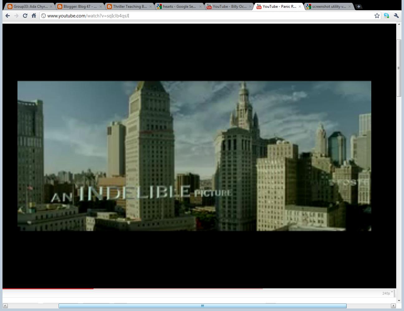
There is one feature in my opening that can absolutely challenge any movie. Locations. I have shown huge amount of different types of architecture, old tramway, city from close ups to extremely long shots. And the movie I can compete with is the "Panic room". However, in my opinion its much different! OF course, I used many long shots and even the same type for title, but the architecture is different. New York has houdreds of huge sky-reachers. My movie has some big buildings, but most of them are old and not-in-so-much-technology. Great 1800's or older building shows that the movie was made in East European country, because it's where most building stand right now.


I did use some close ups on buildings, and this is the difference. They didn't use that to put huge titles over the screen. I used some close ups to show more accuratelly how building look and how let some audience be fascinted by the view.
No comments:
Post a Comment